Project Author: Alexander Lacson
Data Source: Acquired from Codecademy, which says the data is “from the World Health Organization and the World Bank”.
Project Description
This is a project which explores and analyzes a single dataset containing Life Expectancy and GDP from six different countries. This analysis gives us insight into two questions:
- Is there an association between GDP and life expectancy?
- How does GDP and life expectancy differ between countries?
Dataset Fields
- Year. Ranges from the year 2000 to 2015.
- Country. Six different countries - Chile, China, Germany, Mexico, USA, Zimbabwe.
- Life Expectancy at Birth
- GDP
Definition of Terms
- Gross domestic product (GDP), total market value of the goods and services produced by a country’s economy during a specified period of time. It includes all final goods and services—that is, those that are produced by the economic agents located in that country regardless of their ownership and that are not resold in any form. It is used throughout the world as the main measure of output and economic activity.1
- Life Expectancy, estimate of the average number of additional years that a person of a given age can expect to live.2 Specifically, the measure used in this project is Life Expectancy at Birth.
- Correlation Coefficient (Pearson Correlation), A measure of linear association between two variables.Values of the correlation coefficient are always between −1 and +1. A correlation coefficient of +1 indicates that two variables are perfectly related in a positive linear sense, a correlation coefficient of −1 indicates that two variables are perfectly related in a negative linear sense, and a correlation coefficient of 0 indicates that there is no linear relationship between the two variables.3
Countries by Geography
The six countries in the set are spread out over different continents and regions of the world.
How does Life Expectancy and GDP differ between countries?
Life Expectancy
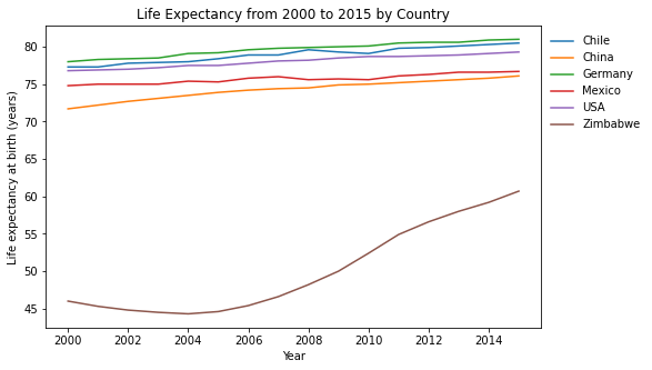
Over time we see a steady increase in life expectancy for all countries. Zimbabwe is separate from the rest of the group but its steep upward slope shows that it is quickly catching up.
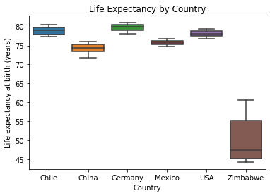
Zimbabwe shows lower life expectancy and higher variation (increasing over time as seen in the previous figure) compared to the rest of the countries in the dataset.
Writing for Brittanica, Clyde William Sanger and various contributors discuss the health conditions in Zimbabwe here. The socio-political discord that amplified Zimbabwe’s problems are discussed here.
GDP
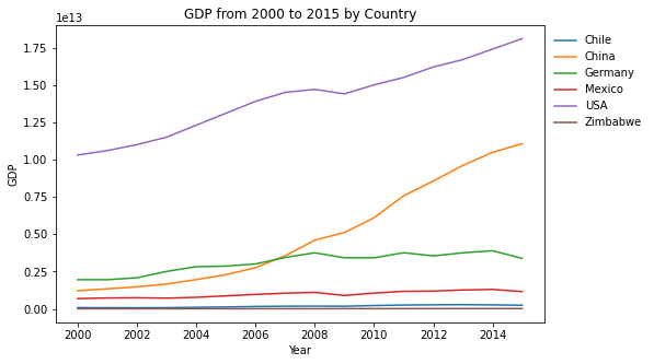
USA and China have economies that grow much faster than the rest of the world.
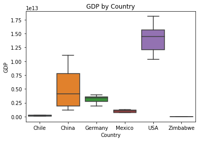
We can see that the US has a significantly larger economy. We can also see that China’s and the US’s economy are undergoing relative great change (growth over time, as can be seen in the previous figure) compared to the other countries.
Is there an association between GDP and life expectancy?
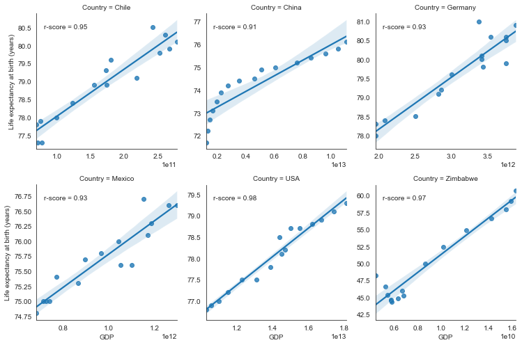
The r-scores tell us that there is a very strong positive correlation between life expectancy and GDP for each country with respect to its own population. The Life expectancy of the citizens of a country is a function of that country’s own GDP. Keep in mind, the r-score only tells us the strength of the association between GDP and life expectancy. It does not tell us how quickly Life Expectancy increases as GDP increases.
Zooming in on China, we can see that it actually consists of two GDP vs Life Expectancy Regression lines. It has a steeper slope in the years 2000-2006, and then suddenly transitions to a more horizontal slope in the years 2006-2015. This seems to act like a ‘missing link’ in our data, showing that at some point a country’s GDP vs Life Expectancy relationship transitions from a steep to flat line.
Unlike the previously calculated r-score of 0.91, the calculated r-score of the regression line for 2006 onwards is 0.98.
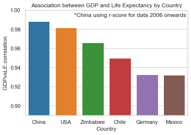
Not all countries have the same magnitude of correlation between life expectancy and GDP. It could mean that for some countries, the health of its citizens is not as dependent on how well its economy is doing compared to other countries. Perhaps the climate, food, environment, political, and geographical factors are having larger influences.
The above plot is interactive.
- You can drag windows over regions to zoom in.
- You can double click on the legends to show only that legend item. Double-click again to show all legend items.
- You can right-click on legends to toggle them on and off in the plot.
- You can get information for each point on mouse hover. The equivalent of mouse hover on mobile is tap and hold
Let us focus our attention on the slopes of the regression lines of each country. We can see that it differs by country. The slope tells us how how quickly Life Expectancy increases as GDP increases. As we move from left to right on the plot, we can clearly see that the slopes shift from vertical to horizontal. This can be understood as ‘Countries with low GDP see great gains in life expectancy for every increase in GDP, but as countries start to have larger GDPs, they have to acquire more GDP to get the same effect on life expectancy’. It seems to bear some resemblance to the law of diminishing returns. This is a reason to give support to developing nations. Small economic improvements they make goes a long way towards improving lives. This would justify institutions like the World Bank. The World Bank is an international organization that offers developmental assistance to middle-income and low-income countries.5
Predictive Modelling Suggestions
For Predictive Statistical Modelling, considering the diminishing effect when viewed across different countries, it could be worth trying to use a higher-order curve rather than a linear curve to fit the data. It could also be worth investigating if there is a “phase-transition” point, where the behavior/slope suddenly changes in a piecewise fashion. This is most evident in the plot of China, where it looks like there is a transition from a steep slope towards a flat slope.
Summary
- Around the world, GDP and Life Expectancy increases over time.
- Most countries have similar Life Expectancies, except for outliers like Zimbabwe, which has suffered under difficult socio-political conditions and a dictatorship.
- The USA has a high GDP relative to the world but China is catching up.
- For all the countries we analyzed, we have observed that GDP is strongly correlated to Life Expectancy.
- There is a trend which suggests that countries with low GDP see great gains in life expectancy for every increase in GDP, but as countries start to have larger GDPs, they have to acquire more GDP to get the same effect on life expectancy increase.
- Following from the previous point, it makes sense to support developing nations because it goes a long way towards improving lives. This gives us a clear rationale for the existence of institutions such as the World Bank.
Suggested Viewing
DON’T PANIC — Hans Rosling showing the facts about population. A highlight of the talk, which ties in to the points made here, is at the 36:00 mark. Hans Rosling begins explaining how a relatively small amount of money makes a significantly large amount of difference for people in the developing world.
References
- Peter Bondarenko. “Gross Domestic Product”. In Encyclopædia Britannica online. Accessed May 04, 2021. https://www.britannica.com/topic/gross-domestic-product
- Judith Marie Bezy. “Life Expectancy”. In Encyclopædia Britannica online. Accessed May 04, 2021. https://www.britannica.com/science/life-expectancy
- Thomas A. Williams. “Statistics”. In Encyclopædia Britannica online. Accessed May 04, 2021. https://www.britannica.com/science/statistics/Residual-analysis#ref367510
- Clyde William Sanger, “Zimbabwe”. In Encyclopædia Britannica online. Accessed May 05, 2021. https://www.britannica.com/place/Zimbabwe
- Mary Hall. “What is the World Bank?”. In Investopedia. Accessed May 05, 2021. https://www.investopedia.com/articles/world-bank-definition/